
Close
Safety Check By FaCEBOOk
Designing a workplace app for office safety
Background and Problem Summary
ServiceRocket was one of the first companies and partners who
implemented and used Workplace as a central workplace
communication tool. It effectively increased our internal
communication and collaboration, leveraging everyone’s
familiarity with its adopted interface from Facebook. Having
accustomed to its many features, we identified key missing
enhancements that we needed, which many similar companies
required which is an enhanced safety feature for
emergencies. I stress the enhanced part because the Workplace,
being an iteration of the Facebook platform can/will have its
general emergency notification system (e.g. earthquake
notification and acknowledgement of safety feature).
What we saw missing was a way to replicate this
feature in a micro-level, or specifically, down to a company
level. We needed a way for companies to be able to handle,
report, notify, and catalog any type of emergencies -- a fire in
one company location, someone hacking into the system, etc. --
and be able to respond to their employees.
Goals
Top-level success metric
- Number of (free) installs on a given period of time
- Number of reports raised and reports closed
Product and design level success metric
- NPS rate of 8
- Ease of completion rating 9
- Error rate of 0
Product and design objectives
- Design a control center for designated security administrators that enables them to raise, respond, and track office emergencies
- Design a notification system that enables employees to raise, report, respond, and track office emergencies
- Implement a notification system that is well integrated with the Workplace platform, making use of its technology
Design Process
Knowing what’s working and identifying what’s important
Analysis
Safety Check By FaCEBOOk
We first did our homework which is analyzing the current Global
Emergency Response Feature of the Facebook platform. We needed
to know how the system worked, how its users responded to
emergencies, and how effective it is, including its limitations
in the context of work environment requirements. We also looked
into features that are available in Workplace and essentially
created a grid of requirements and limitations that defined the
domain of what we can play with.
In parallel, we
initiated a concise user research on how effective the Facebook
emergency feature is, as well as a survey of a set of security
features on the app that we first drafted after our initial
scoping session. With these two major tasks, we were able to
identify four items:
- The Facebook emergency feature and its implementation is a well-received, no-fuss feature that brings relief and awareness to its users
- Workplace emergencies expands general emergencies. Many types of instances are added to what can be considered emergencies that can be specific to an industry e.g. a DDOS attack on a server, a car accident involving company’s delivery service
- Workplace emergencies can be location based e.g. earthquake in our California office but it can also be departmental/functional
- There are three phases in the scope of our safety app that are equally important: the React phase, the Acknowledgement phase, and the Tracking phase
Cataloging our Toolbox
Proof of concept | Wireframes, Sketch, Invision
Our main requirements moving forward was for users to be able to
be notified, act, and acknowledge that an emergency has
happened. Traditional email notifications weren't enough,
in part due to the unpredictability of when users check their
emails and how to monitor and track (proper) acknowledgement of
an emergency. This led the team to investigate the different
features and functionality of the Workplace Platform.
One of the most promising and recent features that
we were able to identify was the use of Chatbots. The Chatbots
Workplace feature provided many out-of-the-box solutions that we
can latch on and take advantage of e.g. instant messaging and
receipt, automated process response flow. With these features
fully developed we were able to find readily available hifi
mockups which were used to run our first set of usability
tests.
Another great feature we were able to identify
was the Workplace user demographic and groups. We were able to
take advantage of this by using office locations and user to
team/function mapping and using them to automatically populate
target audiences for an incident.
Mocking for Safety
TESTING | Wireframes, PROTOTYPES, Sketch, Invision
With the set of tools identified and requirements set, we set
out in creating simple prototypes to test the core hypotheses.
We were able to skip barebones wireframing tests and jump into
more recognizable mockups of Messenger bots (since it’s been
widely used). This gave us focus and close to reality reaction
and validation from how our users will use the app (because of
their familiarity with the Bot feature). Our tests focused on
mocking the 3 important phases of a safety emergency.
Our
first priority in design was to provide an assistive, no-fuss
way for users to raise an incident from their mobile phones. It
should help in efficiently raising a concern through the use of
the technologies and features we’ve identified. We decided to
stagger the input of information between 2 main screens. The
main reason to do this was for users to be able to notify a
safety officer with the least amount of information that the
responsible people need which is the incident, incident
description and location, the latter automatically tagged based
on the geo-location of the user. The next details are the
specifics of the incidents -- who's involved, location
confirmation (which amends the assumed location if different),
type of incident. On this stage a user can also survey the
affected members for their safety.
We conducted
several iterations of testing the mockups in different
scenarios, tweaking elements as we go along. The following are
some of the insights we’ve formulated from the whole
exercise.
Insights
React Phase - The period when a
user is affected (directly, indirectly) by a safety concern and
sends an alert to through the app
- Depending on the gravity of a safety concern (office fire vs malware attack, physical/emotional vs infrastructure) the react time varies greatly.
- Since this is a new app, the habit and/or process of raising a concern is an afterthought as users would normally go about how they would react in an emergency scenario.
- Depending on the scenario, different users who are on the scene may report different emergency situations, although the core of the emergency stays intact.
Acknowledgement Phase - The period when a group
of users (team, company, etc) receives, acknowledges the safety
concern through the app.
- Similar to a characteristic in the React phase, the time for someone to acknowledge/respond to an alert varies to the gravity of the situation.
- Sometimes users don’t respond alert to the alert notification
- Genuine appreciation for the notification is given especially if timely and great disappointment and distrust if the notification is not received and is excessively late.
Tracking Phase - The period that overlaps with
the acknowledgement that monitors the safety concern and the
state of the users who may be involved in the situation
- Because of the response time for users to acknowledge the safety concern limits must be set to take further action
- Timely reports to concerned stakeholders (including users involved) is warranted, valuable
- The reporting, acknowledgement, and tracking of an incident for a company is greatly valued from the legal point of view as the app helps document the incident thoroughly
Optimizing for Emergency Timelines
Design iteration, hifi design | Hi Fi mockups, Sketch, Invision
Across the board, time to report and respond vary greatly
depending on the gravity of an incident. The core priority of
the app was to ensure safety for all who may be involved in an
incident and we needed to cater for the factor of time. We
needed to be in front of the situation but not be a deterrent to
the user’s safety.
Since every situation is
different, we formulated a way for a scenario to be categorized
on it’s severity which defaults certain notification schemes
(time to send notification, reminder, etc.) which can also be
changed on the fly. This per-situation timeline definition
helped greatly in treating an incident on a case-to-case basis
suggesting the right amount of pressure and action needed as it
comes. This also resulted in a contextual reasoning as to why
some users respond (or lack thereof) to an incident and can be
taken on a case-to-case basis by identified personnel to check
on.
Designing a Dashboard for Safety
Design iteration, hifi design | Hi Fi mockups, Sketch, Invision
An integral part of the whole system was for administrators and
people identified as Safety Officers to have a dashboard that
helps them raise, respond and track emergencies that happen
within their companies and teams. The following were the most
important design requirements were identified, focusing on the
overarching goals mentioned previously.
- A stripped down dashboard that lists incidents raised, ordered by the state and severity of an incident.
- A list of relevant events from identified feeds (RSS, Twitter) that may or have affected related locations / employees.
- A quick and easy way to have a reporting tool to raise incidents
- An Incident page that displays effectively the state and other relevant information regarding that incident. These can be a combination of the following
- Response summary report of employees that may have been affected by the incident e.g. Unconfirmed, Negative Response, Positive Response.
- A map of where the incident happened/reported if available
- Ways to send notifications or “rechecks” to identified employees who haven't been confirmed via the Bot.
- Relevant details for each identified members (eg. personal phone/email, etc.)
- Related consolidated events feed coming from identified relevant channels
- Summary of the Incident report that was raised
Ensuring Feedback Loops
Design iteration, hifi design | Hi Fi mockups, Sketch, Invision
It was important to ensure regular, closed feedback loops
between people affected and the safety officers throughout the
whole time an incident is active. Once we integrated the safety
app with the app’s dashboard, we were able to iterate through
our identified scenarios and identify potential comms failures
and improve on them.
What we implemented in one of
our first iterations was an automated notification system to the
persons/teams involved and to the safety officers and
responsible individuals (managers, lawyers, etc). The cadence of
automated notifications depended on several factors which mainly
revolved around the severity of the situation (persons involved,
type of incident, etc). What we also ensured is that every
query-response between a user and a bot regarding the situation
has a tight loop (no open ended questions / AI assisted) and is
often given a link to a summary of the situation.
Improving the way to create elearning
Summary
Our product team wanted to create a new revenue stream on the elearning landscape and our enterprise elearning application fit the bill. We had to rethink, trim down, and validate and revalidate our assumptions. We developed a leaner elearning application based on what we know and what we validated from our existing/potential customers and managed to produce a design system along the way.
Background and Problem Summary
Our elearning enterprise application has grown significantly both in form and functionality relating to the growth of different types of elearning components and structures that are used to create a course. This has caused the process of creating courses and its lessons cumbersome and inefficient. Our company decided to create a leaner and more efficient version of the product that contains a trimmed down and more efficient course creation process.
Goals
Top-level success metric
- Number of paid sign-ups to use the light version
- Create a new business stream for those who prefer a leaner and lighter elearning platform
Product and design level success metric
- Course creation time to time to consumption
- NPS score of usability of the course editor
Product and design objectives
- Improve the current and next generation course creation process
- Ready the framework and implementation that can be reused in the enterprise version
- Kickstart the development and use of the product’s design system and refresh outdated visual designs
Design Process
Trimming the fat
AnalySIS | Google Analytics, Hotjar, Segment
Internally we have known that we would need to dramatically trim
down the set of features and functionalities our enterprise
application offers to be able to be in an opportunity to cater
to our target audience. We also knew we needed to be smart and
critical about our decision making process and what types of
questions, data, and analytics we would want to use to help us
in making those decisions. Luckily, our teams have put us in a
great situation wherein getting those data was easy and
straightforward.
Our data sources are pretty
straightforward but the quality of what we were able to mine was
immensely helpful. Of course, we still had to do our due
diligence in conducting usability interviews and prototyping but
because we had a good percentage of quantitative data, we were
able to focus on validating our assumptions through our
qualitative data gatherings.
- The team drilled down the usage of the different functionalities we have on our enterprise application, specifically on how much each particular component has been used in a N number of courses. This gave us an overview on how much those components were being used: high, moderate, or low.
- The next step was analyzing as to why those components are being used in those frequencies. This is to validate if the components were not user-friendly, doesn’t fit to a certain criteria, or doesn’t fit to a certain business model.
Jumping in and venturing out
Proof of concept | Wireframes, Sketch, Invision
Our next step was to validate what the data was showing us
through user interviews and getting actual insight as to why
users weren’t using specific elearning components,
functionalities and/or features of the application. This
resulted in a variety of reasons which was grouped into two:
valid and invalid (validity isn’t denoting the reason is invalid
for the customer to not use the functionality, it is validity of
the reason to include or not include the functionality to the
new product).
After getting qualitative feedback
from our current customers and validating some of our
assumptions with our quantitative data we purposely revisited
our enterprise application user personas and evaluated which
ones should be modified and migrated, or be cut from the new
app’s personas.
Making it lean
Testing our assumptions | Wireframes, Sketch, Invision
Once our teams were comfortable with several set of assumptions
we went ahead to test them by creating a low fidelity prototype
through simple wireframes. Our main goal was to test and get
data that would prove/disprove how the main flow of course
creation would perform. Basically our main targets were ease of
creation and high usage rate for selected components.
We
also ran several exercises validating if our product terminology
fits the trimmed down version of our product. This was another
critical part of the project, as we all agreed that we can’t
make an assumption to reuse our old terminologies because we
were catering for a different context and audience. We used XXXX
and ran a very simple XXXX to test first our current
terminologies on how effective they are and then ran another one
to test our revised list. After this, we ran a XXXX to test our
information architecture.
Insights
- We can further trim the elearning components as more advanced components aren’t used because of the set of use cases we want to serve. This has a trickle down effect as some components are related to each other
- Majority of our terminology and structure fits our new use cases as many of these are generally used across the elearning community
Packing (and repacking) it all in
Design iteration, hifi design | Hi Fi mockups, Sketch, Invision
After our first initial design iteration we pushed on applying
what we’ve learned to an actual baked product. Aside from the
general flow of the pages/interactions and information structure
the engineering team needed detailed mockups and micro
interactions of our different components/elements.
We took this opportunity to also apply and test a
refreshed branding style that is more up-to-date, that also
lends itself to the simplicity of the product. We produced
several high-fidelity prototypes and ran them through our
previous test cases with potential users, analyzed the results,
looked into the finer interactions between components, and
applied changes to any changes. Rinsed and repeated for another
round before the product and design team handed it to
engineering.
Insights
- Combining lofi feedback/improvements with branding refresh muddled our first hifi data analysis as it combined feedback and improvements on both fronts
- Pushing back of using engineering resources / pushing hifi mockup prototyping saves a lot of development and iteration time of close to MVP version
Goals Review
We rolled out the project a little over a year after the
inception of it, which is a little over our target deadline.
What the whole team was able to accomplish follows:
- A new elearning Sass application, which can be ready in a few minutes for a customer to create an elearning website
- New customer segment has been created an has N* signups after X* months
- A leaner and more streamlined course creation process. A course creator can create a full course with N* lessons that is (X lessons)(-10x)* faster than our enterprise application and is on par with our new competitors in this elearning segment.
- The product’s learning components have an increase of % usage rate and no component is not used by any elearning schools
- Using our learnings and new design system, our current enterprise application is undergoing a review to improve based on the new course editor
Rethinking and redesigning a product symbol
Background and Problem Summary
After some internal deliberation our product and executive teams
decided to use a symbol to drive the refresh of our Learndot
product's branding. Prior to that we decided to stick with
just the wordmark, however we figured to best bring back the
symbol to:
- For product completeness - a symbol is essential as part of the identity of Learndot. There are marketing, product and engineering scenarios that need a simple but relatable identification back to the product.
- For technical(UI) completeness - to cater to several UI opportunities and limitations that are enforced by different UI, ecosystems, and OSes frameworks like favicons, avatars, integrations, and apps. The wordmark "Learndot 'by ServiceRocket'" isn't flexible enough to cater to these needs.
- For branding - similar to UI limitations, there would be instances wherein limited dimensions are needed and our current wordmark isn't flexible enough.
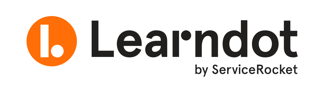
The Learndot product had an existing symbol, however we wanted to create a new one for:
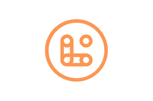
- The symbol is unique but does not relate back to the wordmark and as a full lockup type, there is a sense of indifference and not harmony.
- When used soley, does not connect well with the branding because there are no visual cues that connects it back to the wordmark.
Thought Process
I approached the design by focusing on what's going to stay
within the full lockup logo. The new symbol had have a natural
progression when seen together with the wordmark. Considering
this, we steered away in the use of radiuses for corners and
gradients for color. Then I focused on what visual cues we can
borrow, again to further the connection between the elements
between the logos.
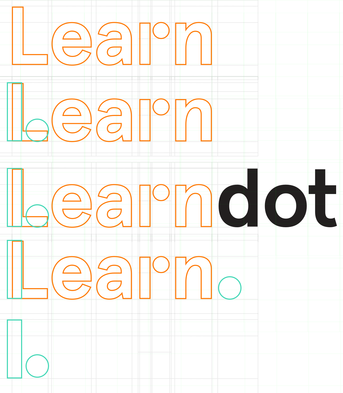
- It connects well with the wordmark, having several visual cues that go back to it, as well as visual cues relating to the word "Learndot".
-
It's unique, strong, and can stand on its own but
relatable to the wordmark and to the brand.
-
As a full lockup type, the consistency between the symbol and
the wordmark is more harmonious.
Connecting two teams on two systems
Background and Problem Summary
Jira and Workplace are two great platforms for collaboration.
Jira, originally developed as a bug tracking tool by Atlassian,
has significantly grown out from its shell and has evolved to a
fully fledged collaboration tool for tasks, issues, roadmaps,
helping teams and organizations move forward. Workplace is a new
instance of Facebook dedicated to the work environment, taking
advantage of the huge design familiarity of features and
concepts from the Facebook platform. It pivots it’s focus and
functionality on helping work environment teams collaborate not
just internally but also externally.
Collaboration
within these two systems are incredibly high but collaboration
between these two systems are full of friction and challenges.
Information redundancy and lack of knowing that an information
exists are the two main problems in collaborating between these
two systems, which our project aimed to solve. We had to devise
a way for an integration and an implementation to seamlessly
solve collaboration issues between users of these two systems,
oftentimes having access to both systems.
Goals
Top-level success metric
- Number of free sign-ups during a 3 month period
- Reduce rate of browser traffic - (clicking of a link ) to and from both systems
Product and design level success metric
- Seamlessly integrate conversations between Jira and Workplace
- NPS score of 9
Design Process
Reviewing the Integration Party
The team had been fairly familiar with Jira, through years of
custom development and daily use. With an internal expert
knowledge of how integrations work in the backend we evaluated
our current integrations (specifically, the company’s widely
popular integration with Salesforce) and highlighted several
aspects of the design that are loved by its users. We also
highlighted several pain points. At this point we didn’t filter
yet what we think may or may not apply to the integration we are
building as we wanted to collect as much idea as possible and
converge later in the design process.
With Workplace
being fairly new to the scene, there were quite a few
integrations out-of-the-box. Facebook, Drive, Youtube, but not
yet one that existed to a cross collaboration tool like Jira. We
reviewed the current, beta, and alpha functionalities to see
what potential routes we can do.
Jumping in and venturing out
Proof of concept | Wireframes, Sketch, Invision
Our next step was to validate what the data was showing us
through user interviews and getting actual insight as to why
users weren’t using specific elearning components,
functionalities and/or features of the application. This
resulted in a variety of reasons which was grouped into two:
valid and invalid (validity isn’t denoting the reason is invalid
for the customer to not use the functionality, it is validity of
the reason to include or not include the functionality to the
new product).
After getting qualitative feedback
from our current customers and validating some of our
assumptions with our quantitative data we purposely revisited
our enterprise application user personas and evaluated which
ones should be modified and migrated, or be cut from the new
app’s personas.
Validating Ideas of Value
Our next step after ideating on some ideas that we think would
bring value to users was to validate and rank them to identify
what can go to our MVP roadmap. We latched on to Workplace’s
multi-company functionality, inviting potential users and
customers to collaborate on functionalities and needs they think
are valuable to them. We identified several participants and ran
a survey and an interview with them.
Field Market Survey
-
This survey mainly focused on (1) Getting demographic
information of a company who would be interested in the
integration and
- (2) Validating 6 ideas through ranking
- (3) Know other use cases / challenges their users face in using Workplace and Jira together
Interviews
Our surveys led us to several key customer collaborators who we
next interviewed. The purpose of this interview was to get to
know more about the key persons who evaluate a tool and make a
decision on how and how much value a solution we are offering
can bring and/or problems it can solve within their
organization. These persons have collected and identified
feedback and problems raised by their teams that are related to
their work using Workplace and Jira. We also identified
potential personas who may use our products on different levels
or parts of the integration.
Drilling on Ideas and Picking Most Valuable
At this point, we have several data we can work with:
- Existing similar integrations’ feedback, pain points, value
- Scope and limitations
- Ranked ideas for the the new integration
- Target customers/personas
We deliberated on the ideas to identify a set of features that
we would want to prototype and potentially be slated on our MVP.
We worked around the exercise with one question in mind - “Given
the business goals and requirements, which of these ideas would
give the most value to our potential users that we can develop
in the next 2 months”.
We landed on picking the most
voted and easiest to implement solution - syncing a comment from
Jira to Workplace. The gist of the problem is that communication
regarding a specific issue gets confusing and oftentimes lost
when a user posts an issue (link) on Workplace and some
Workplace users converse on the Workplace thread where the issue
was shared. This brings communication friction because of the
following reasons:
- The full context of a Jira issue is not immediately available when shared to an external website, this includes important comments regarding the issue
- When someone comments on a Workplace thread regarding the issue, these comments aren’t available to the issue itself
- There are instances where a user is limited to either just Jira or Workplace, not having the option to see the full context of the issue
- The back and forth and time notation of someone trying to piece together a conversation between the two platform is extremely tedious, confusing, and a waste of time
The team was fairly familiar with the selected problem to solve,
having developed a similar solution in one of our other
integration products between Salesforce and Jira. We then
combined our requirements, customer expectations, ideas to solve
this problem, and translatable solutions from our experiences to
develop a simple prototype to validate our assumptions on how
the chosen problem would be solved.
Usability test on existing integrations similar to what we want
to solve
The team knew that initially we can only solve the general
communication problem one-way (syncing comments from Jira to
Workplace and not the other way around yet) because of the time
constraints we’ve set at the start of the project. And this
posed a user value question - “Would users value a solution to a
problem that only solves half of it?” Alongside our general
usability tests of how well elements and functionalities are
presented and interacted with by the user, we wanted to know how
much value that solution would bring to the customer, with the
said limitation.
Once our prototype was ready we
went back to our participants and ran our usual usability tests
to check how well our implementation runs with customer
expectations. We encountered similar reactions to the
unfamiliarity of how a thread of conversation can get confusing
when synced across two platforms, especially at that moment
because we were only syncing one-way. This reflected in the 2nd
part of the usability exercise, where we asked the participants
the question of how much value does this part of a solution
bring in solving the issues they raised initially. The
incomplete solution was actually received well but 4 out 5
respondents gave the following feedback (summarized and
combined):
- The solution presented, even partly implemented (syncing comments only one-way), gives our users information about a different conversation that does not originate from the actual thread. It can be confusing and clunky at first but the feature of knowing a separate conversation exists is valuable.
This feedback gave us pause to ponder and look at our solution
one more time. Our proposed solution (already slated as an MVP
feature candidate) does bring value but is far from a complete
solution. Unfortunately, being incomplete does add to the
deterioration of the user experience, albeit something that can
be overcome from time of use and familiarity. However, the team
asked a what if- what if we can deliver a simpler but complete
solution that would bring the same value to our users?
Back to the drawing board
We quickly threw some ideas to the table and ended up with a
simple “Info integration box” that basically tells any Jira user
who views an issue if there’s a thread in Workplace that the
issue was mentioned. The team drew up some wireframes to
validate our common understanding.
Once we got to a
common ground with feasibility of development confirmed, we
developed lofi mockups and ran a quick usability feedback
exercise to customers. The solution did not wow them but more
importantly we validated our assumption that this new simple
solution would bring the same value compared to the previous
solution without the cons of it and can be developed and
released faster to beta.
Development and Beta release
Even with just a lofi mockups we were able to skip hifi versions
and tests as our solution was simple enough that doing another
round of testing would give us diminishing returns. The team
developed the feature pretty quickly and we were able to roll
out our beta version and deliver some value to our users fast,
considering the pivot we had to do during the first development
cycle.
Improving the UX Maturity of an Organization
Background
The UX Maturity Model is a 5 stage gauge as to how mature an
organization is in terms of how effective and engaged they are
in their UX efforts. The grading process is arbitrary but is
dependent on a contract and agreement between the
product/service owners and stakeholders. It is also crucial for
us to be critical to our ratings to set the bar high for our
goals.
The 5 stages of UX maturity are:
-
Interested - UX is important but receives little funding in
budget, time and resources
-
Invested - UX is very important and formalized programs
emerge
-
Committed - UX is critical and execs are actively involved
-
Engaged - UX is one of the core tenants of the company's
strategy
-
Embedded - UX is in the fabric of the company not separately
discussed
It is worth noting the following information:
-
37% of companies have not yet reached the first stage of
maturity
-
41% of the companies are in the first two stages
- Only 4% are in the 5th stage
One of the goals I’ve set as the head of usability and design
was to improve how much we value usability within the company
and how much value it delivers to our users and to us. We’ve set
this as an overarching goal, and each initiative or task needed
to be aligned with that. It was also important to align each
initiative with the company’s goals and objectives. We believe
that in doing so would make our climb easier, with the company’s
full resources pushing us up and not the other way around,
because each initiative will be a win-win outcome for both.
Identify metrics for evaluation (testing, design systems, user personas)
As stated, UX Maturity Levels is an arbitrary set of ratings a
company can use to itself to gauge how it can improve itself.
There are several resources out there that discusses this which
served as a guideline for us. At the beginning of this huge
exercise, we translated what does every level (Interested,
Invested, Committed, Engaged, Embedded) specifically mean to
us.
We started by listing as many usability
exercises, design practices, design methodologies we can think
of. Some of these we have been using or had used, and some we
have never used or tried. Some of them we never even have heard
of. At this point it was more important to collect all these
data (which gave us a lot of insight into the range we can
explore later). We grouped these into different types -
testing/prototyping, interviews, methodologies, tools,
artifacts. The next was the easiest part of the exercise, which
was basically marking all of the UX “things” we currently use or
are doing. The result was quite humbling, because an expanse of
unchecked “things” was very apparent. However, we reminded
ourselves that - we just started and this is a good first step
and that even after plotting which “things” we want to do to
achieve high UX maturity we shouldn’t have an excessive amount
of tools, tasks, process, etc. to do that if we’re smart.
The
next step was to assess each business team and each functional
team within the organization. We took note and plotted all UX
related activities and tools that we have in our arsenal and
also noted which ones we’ve had success with. It was important
also for us to take note of any tools that had an overlap in
functionality and also similar tools between teams that can be
later combined (to reduce cost). Lastly we took note of any UX
training, groups, and activities that our employees have or are
engaged in, and similarly surveyed which one was effective and
brought value to our work.
In parallel to the step
above was the evaluation of how our UX related efforts extend to
the products we are developing. This heavily involved the
product and business unit teams as we surveyed the different
tools, artifacts, and processes a product goes through in our
development processes. These ranged from:
- Product insight interviews
-
Usability prototyping (lofi, hifi)
- User persona development
-
Design guidelines / design systems
- Automated UI regression testing
- A/B testing framework
- Other UX tests and analyses
Create a scorecard
At this point, we have a good set of understanding on what we
currently do and have, as well as what else we aren’t doing, can
do, and won’t do. We created a scorecard per each functional
team, and product, and a combination of both for each business
unit. And all of these feed towards the top grading for the
company which is basically the total score from each BU. It was
a simple formula but I believe this worked well to make it
easier for members and teams to see how our efforts centred to
UX contribute to the overall goal.
Understanding the Goal
This first exercise was very critical to the overall process
because it produced a more tangible guideline on how to achieve
the goal of improving the UX maturity. Think of the UX maturity
as a grand painting and the scorecards as grids on the painting,
with each grid we work on contributes to the overall vision of
the painting. Breaking it down this way made it easier for us to
work in smaller batches but still understand how we are
contributing to the bigger picture.
It was also
important to plot the overall goals and tasks and how it aligns
with the company goals. The combination of these points makes it
easier for everyone to know how they are contributing to (1)
Company goals and (2) Maturity of UX in the organization.
Setting up the foundations
The UX&D team is a functional team that contributes across
the organization by facilitating people and work needed by each
business unit. We wanted to establish a baseline of expectations
of what business units can expect from this team, for
example:
-
A UX/UI designer knows how to wireframe
- We use Invision for prototyping
-
We run design retros immediately after a prototyping
session
Design request is handled byThe above set of examples can be
categorized as expected knowledge in:
-
UX Methodologies and best practices
-
Preferred tools and standards used in the organization
-
Processes within and between teams
One critical step we took was we identified individuals (not
limited to the UX&D team) who are essential in the product
development process to usability courses in Interaction Design
Foundation. We invested in this program for us to have a common
and shared understanding of what we mean when we talk about
“User Persona”, and what are our baseline expectations of what
an artifact would look like.
Internally, we defined
sets of mini-processes that can be plugged into design sprints
depending on what type of usability exercise is needed by the
product team. Lastly, we identified preferred internal tools and
processes that are helping us to have a standard protocol in our
communications and handovers.
Long way to go
In our current state, we are running several streams of
initiatives that contribute in improving our UX maturity level.
An example of these initiatives is the two major goals that
applies to several business unit are:
-
Building consistent and scalable designs
-
Putting the user at the decision table
Some of the sub-initiatives we have that contributes in
improving these goals are:
- Development and use of design guidelines and design systems
- Since starting the mission of improving our UX maturity, we have developed and rolled out 2 design systems and 2 design guidelines. These are all still under development and are regularly updated and iterated on but have been beneficial to many teams, improving our speed and consistency in putting out UI components.
- This has been a great collaboration between functional teams - DevOps, Engineering, Product, and UX&D.
- User Persona Development
- Many of our products now have user personas and many more underway. This was one of the first steps in reintroducing our users to our product development lifecycle and we are tinkering with our process on how we can make them more present in our discussions (for example, renaming User Stories, documentation links, etc.)
- Deliberate inclusion of usability tests and exercises in the design process. These range from:
- Card sorting
- Lofi/Hifi prototyping
- Surveys and interviews
There also has been organic growth within the company, some
initiated by other functional teams. These range from new
engineering chapters dedicated to UX and UI to direct hire of UX
designers that are embedded in a product development squad
(engineers, UX designers, product manager). We’ve also created
several social groups where individuals can freely share
insights, threads, and questions centered around usability and
design.
The talk of UX within the company is more
natural, and is becoming more and more part of our vocabulary.
The usability scorecard evaluation has a regular quarterly
cadence and one is due soon but it’s safe to say that we’ve
bumped a level since we’ve started, and will continue to
improve.
Implementing Design Systems for ServiceRocket
Background and Problem Summary
ServiceRocket is a company focused on bridging the gap between
new technologies and companies. It’s in the business of software
adoption, partnering with several companies, namely Atlassian
and Facebook, who have great products that help other companies
collaborate and function. ServiceRocket, as part of their
software adoption mission, also develop their own eLearning
product called Learndot which focuses on providing elearning for
new products to be learned by its users internal and
external.
In this environment, ServiceRocket is in
many ecosystems, catering to many types of users, meeting
different expectations. This poses a great opportunity and
challenge on the design and development of products by
ServiceRocket to each of these platforms. With each product’s
product teams solving their business problems within the
product, we looked in to solving company wide problems:
- How can we set a guideline for designing products for other platforms?
- How can we help product teams be efficient in getting ideas out of the door consistently?
What was clear to us were several things:
- Each ecosystem provided their own branding and design guideline. Some of them are inherently/forced to each product developed within it. This lent a big help in our product and development teams to be consistent.
- However, inconsistencies were still very much apparent. These ranged from the following:
- Branding (logo styles)
- Vocabulary (“Save” vs “Update”)
- Interactions (disabled states)
- Functionality (how search results are displayed)
- And many more.
- Inconsistency also was apparent when some elements not available in the ecosystem but can be developed in it independently without the use of the ecosystem’s style guide
Seeing through the customer's eyes / The Question of branding / Mission - Software Adoption
One important factor that was raised by our stakeholders and was
an apparent issue in our cataloging was the subject of branding.
Back then, our products’ identity as our product was sporadic.
Sometimes we’ll use our company logo for one product, and in
another case we’ll use some icon resembling (what we think) the
product’s essence. There were also cases where we thought our
products identity needed to fill in a gap in the design. An
example of this is for Learndot, our eLearning platform. Our
customers who use the system have their own branding and
identity but do not necessarily have components and
functionalities designed for eLearning. At this point, because
of technical limitations and assumptions, we combine our styles
with theirs having a page and its elements designed a certain
way, and a different one in another.
These scenarios
posed a very complex set of problems in different tiers
(customers, users, partners, ourselves). We knew immediately
that we wouldn’t be able to solve this big problem by clubbing
everything together and then solving it, but we did identify
similarities with the problems raised.
What was
apparent though, was the core principle on how we were going to
solve it-- which is part of the company’s mission - helping our
customers achieve better software adoption. How
does this apply in practical terms? It means that we see through
our customer’s eyes and ask how will our branding affect the
user’s experience in the use of our product within our partner’s
ecosystem. For example, in making a decision of what color to
use for a button, we would ask ourselves - would the brand color
enhance their experience or would it cause friction? Is our
typography in a card component consistent with the partners’
typography or would it cause a mental pause of unfamiliarity
with a user because it’s different? In almost all cases, the
answer was right in front of us. Our customer’s experience is
more important than our branding, because that’s what it would
take to achieve better software adoption, our mission.
We
put this as the one tying principle and decision maker in our to
be developed process.What we formulated then is to build a set
of processes in solving these problems independently.
Developing a process that involves everyone in the team
What we wanted to achieve in solving our scaling and consistency
problem was for everyone to buy-in to the use and maintenance of
the design system per product. A “Design System” means many
things in the design and product development industry (branding
guideline, pattern library, design tool component library, etc.)
but we defined ours as:
“A design system is a collection of tools, processes, and
people that collectively produce and maintain elements,
artifacts, and assets that help our product and teams be
consistent and scalable across the board that helps enhance
the product’s user experience”
An important part of our definition of system is
the people participating in it. We divide this into two
categories: the people who use and contribute to the system, and
the people who develop and maintain the infrastructure and
processes of the system. Note that many people overlap between
these two categories. One important aspect of this is that we
made a purposeful choice to include as many functional teams as
possible in the development and maintenance of the system. This
has a two-fold benefit: we have a more diverse pool of ideas and
guardrails coming from different teams (marketing, product,
usability, etc) and those people from different teams become
ambassadors in the use and adherence to the use of the system.
The Specifics
I’m going to detail below the different tools and how teams use
them, and then an overarching process on how it all ties
together. I will be using a usual request that would come in to
a product’s development cycle.
Prerequisites
-
A developed branding guideline that has the core elements
(color, typography, etc) defined
Workflow
An improvement is raised to change the style of a link to a
button
- System: Jira
-
Reviewed (change request approved/denied) by product and
UX&D team
-
If change affects branding, Branding team is involved
-
If approved Issue is linked to a new issue to do the design
change request in a different Jira Project dedicated to the
product’s design
Design request is handled by Product and UX&D team
- Systems: Jira, Sketch, Invision
-
Request is assigned to designer, and works 1st wireframe
iteration on Sketch
-
Wireframe is reviewed for approval by Product/UX&D
team/Engineering in Invision. Iteration will be required if
necessary. Usability test will be required if necessary
-
After initial design approval lofi/hifi mockups/prototypes are
developed (fidelity depends on complexity of the design) and
goes to another approval iteration
-
After final approval of the design the UX&D team updates a
shared Sketch library of components
Design request is handled by Engineering
-
System: Invision, Jira, Git, Storybook, Jenkins, AWS
-
The next handover is for the engineering team to develop a UI
element as an HTML element (HTML, CSS, JS, React/Angular,
etc.)
-
Issue is assigned to a front-end developer and develops the UI
element
-
Design is reviewed by the designer. At this point limitations
on the engineering side may still popup and it can go back to
the previous process.
-
Once component is developed and approved, developer pushes
changes to main branch of the design system’s component
library
-
The push to the main branch of the repo it automatically is
triggered to update the production copy of Storybook where
components are available for consumption
- Issue is closed
Implementation of design on Product
- System: Jira, Storybook
-
Original issue is updated with details about developed
component
-
Issue is assigned to engineer that will update the reference
of new design library (external CSS) in the Product
-
Automated UI testing is done and iterations are done if
necessary
-
Review and approval from Product team is handled
- Original issue is closed
If Change affects public branding
-
Systems: Jira, Marketing web publishing platform
-
Original issue spawns another change request on a different
Jira Project for Marketing
-
Task to update all necessary public facing media is assigned
to marketing team
-
Marketing / Branding team reviews and approves changes,
iterations are done if necessary
-
Changes are pushed to product/assets are republished
The Big (Necessary) Push
One great push the initiative got was the support from the
executive team and the general managers of the product, with
them seeing the problem of scale and inconsistency in their
products and the solution in doing the initiative. As I
mentioned before, one great hurdle an initiative like this will
encounter is getting buy-in from your teams. Having the
executive team not only backing it but "ambassadoring"
it was a huge boost in getting over that hurdle.
Current state
At the time of writing, we have started 3 design systems, each
quite unique from each other with tweaks in the processes and
development cycles to accommodate the product’s development
cadence and the people working on those teams. We are in (and
will be for a long time) progress of the following items in the
said design systems:
- 3 design guidelines
- 3 Sketch component pattern libraries
- 2 Storybook instances
- 3 design workflows in Jira
- AWS (S3, Cloudfront) setup
We currently have these functional teams working with the
products teams:
- Engineering (Ops)
- Engineering (Frontend)
- Product
- UX&D
- Marketing
- Executive
These design systems now serve as a crucial pillar in 3 product
lines (20+ apps, 1 enterprise platform, 3 public websites) and
are continually helping those teams scale and be consistent in
presenting their products.
Selected Work & Case Studies
Designing a workplace app for office safety
Improving an eLearning creation process
Rethinking and redesigning an existing symbol
Connecting different teams from two systems
Improving the UX maturity of an organization
Developing design systems for multiple BUs
About & Contact
Hi there,
I'm a Product and UX Designer and the Co-Founder and CEO of GoodWeb. Previously, I was the Head of Usability and Design at ServiceRocket. I'm also an advocate against Dark Patterns, presently researching on ways how we can solve it as a community (I try to write about this for now). Contact me if you have ideas!
I mostly design and balance product usability and UI with product and engineering teams, and often times validating value with our users. I usually drive and manage design systems as well, for scale and consistency. Occasionally, I also do brand design and brand management.
I currently live in Santiago, Chile. A Celtic fan, ASOIAF and First Law series groupie, and a Metallica nut. I also do street photography.
Cheers,
Yel


